You are here
Co-designing infographics for climate change action
Infographics are a great way to facilitate decision-making and catalyse action through communicating complex information quickly and clearly.
The science on climate change is clear. However, there is still a sizeable gap between the call to action presented by climate science and the realisation of action in the spheres of policy and government decision-making, and within business communities globally.
Infographics (information graphics) are representations of information in a graphic format designed to make the data easily understandable at a glance.
Stephen Flood is a Post-Doctoral Fellow at the New Zealand Climate Change Research Institute at Victoria University of Wellington. His research interests are climate change adaptation, co-generation of climate change knowledge for decision making, livelihoods and resilience, and science communication. He finds that challenges in his research are often centred on the issue of effective and impactful science communication leading to action.
Stephen has recently completed a 5-month collaborative project generating infographics for use by city and regional council staff. Co-production of knowledge is a method of connecting disparate knowledge systems and collaborating towards a shared goal. The infographics in this project engaged with co-production of knowledge techniques to co-design outputs focused on council-relevant climate change adaptation issues.
The research process began with an online survey of councillors and council staff to determine their topics of interest in the area of climate change adaptation. Stephen engaged a team of collaborators to participate in the co-design project. The team consisted of a graphic designer, environmental social science researcher, and council staff from the regional and city councils in Wellington.
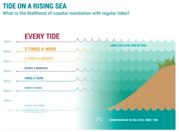
As a group they decided to create two infographics in line with council needs. These were titled ‘Heavy Rainfall and Urban Flooding’ and ‘Storm Tide on a Rising Sea’. They used an innovative online design tool (InVision) that allowed the group and others to post feedback and suggestions as the infographics developed. The graphics were sent to a number of climate scientists to ensure the information was communicated in a scientifically robust manner. With the final infographics now completed, the next step is an evaluation process to determine the effectiveness of the outputs and elicit feedback on how they might be improved.
Some of the key learnings from the experience were:
• it is important to engage early with end-users to determine their information needs and objectives;
• generating iterative and ongoing feedback throughout the process was very valuable;
• working with a graphic designer allowed the team to harness their design and information communication expertise; and
• communicating the information as clearly and simply as possible while maintaining scientific rigor is a critical requirement.
How can you use infographics in your community?
What value can you see in collaboration?
More information:
Presentation by Stephen Flood, Victoria University: http://www.climate-energy-college.net/files/site1/seminar_documents/Stephen%20Flood%20slides.pdf
Infographics on CoastAdapt: https://coastadapt.com.au/infographics
hzrhd9op3qp8u2ec.png