You are here
Using climate data to understand recent climate trends
Australia’s climate is changing and national mapping products can provide useful information on recent trends.
At a glance
- Australia’s climate is changing, which means that long-term averages of climate no longer provide a reliable guide to the future.
- Planning and decision-making for the coast needs to consider recent trends in climate, as well as projected future changes, particularly where community assets or safety are concerned.
- Identification of climate trends often requires larger regional or national scales, and longer time periods, as climate variability can mask trends in local areas and over short timeframes.
- There is up-to-date climate trend information available from the Bureau of Meteorology and the Climate Change in Australia websites for a wide range of climate variables. This can be readily downloaded and used in risk assessment.
Main text
1. Why climate trend information is important
Analysing trends over time in climate variables is an important tool for understanding whether or not the climate is changing, and the causes of any change. Knowledge of trends can ensure that decision-making reflects current climate in sectors that are climate-sensitive, and that changing climate risks are adequately considered.
The climate is not static. Across Australia there is a wide range of climates, as well as considerable climate variability over time in any region. This needs to be taken into account when looking at trends.
- Thinking about spatial variations: A wider regional scale is generally needed to identify trends, as patterns of climate variability can mask changes in the climate at local scales, particularly for rainfall.
- Thinking about changes over time: You need to search for trends over long time periods - several decades or more. This allows the trend to show clearly against the background of year-to-year natural variability. Decisions based only on a short period of climate data could turn out to be poorly matched to future climate conditions.
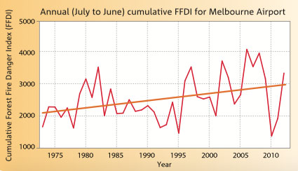
Figure 1 shows clearly how looking at only a short period of climate data can be misleading. If you take only the period 1980-1990, there looks to be no trend, or even a slight downward trend, in the data. Yet over the complete period there is a clear upward trend (as shown by the straight line), indicating increasing risk of fire over time.
T1M1_Figure-1.jpg
Climate change is a contentious subject and one of the major tools to prove or disprove its existence is trend analysis. This means there are many articles and web pages that seek to support a position on climate change by demonstrating trends or by seeking to demonstrate that trends don’t exist. When looking at these, it is worth considering:
- How long is the data set? If only a few years, that should set off alarm bells.
- Is it based on just one station record, or has a regional/global analysis, averaging across a number of stations at each time point, been carried out? If just one station, then again it is worth questioning the results.
This website provides an interesting perspective on how climate data can be manipulated to support a particular point of view: http://www.realclimate.org/index.php/archives/2012/03/data-presentation-a-trend-lesson, (accessed 22 March 2016).
2. Understanding trend information
There is a wide range of information available on recent trends in key climate variables from the Bureau of Meteorology website, the regular State of the Climate reports on the Bureau’s website, and from the Climate Change in Australia website managed by CSIRO and the Bureau of Meteorology.
Climate trend information can be presented in a number of ways. This section summarises how trends in climate information are typically presented.
Time series graphs
Graphs generally show the climate variable on the y (vertical) axis with time on the x (horizontal) axis (Figure 2 and Figure 5 of Observed climate and sea-level change).
It is important for trends in graphs to be identified over a reasonably long time period, preferably several decades or longer. The observational records of most climate variables show considerable fluctuation on a daily or monthly basis, and appropriate averaging of the data can help in the discernment of trends. Graphs often show anomalies from a set baseline (e.g. Figure 7) – this is important when averaging across a number of stations to make sure there is a common baseline.
T1M1_Figure-2.jpg
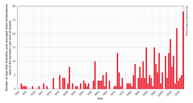
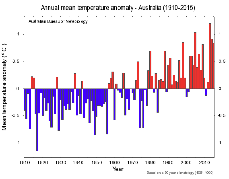
Bar charts
Bar charts are similar to graphs in that they often present the climate variable on the y (vertical) axis with time on the x (horizontal) axis, see Figure 3.
Bar charts are useful in showing trends in the number of occurrences of a particular climate or weather event over time. The greater the length of the bar the more frequent the occurrence of the climate event. Each bar represents one time period, typically one year.
T1M1_Figure-3.gif
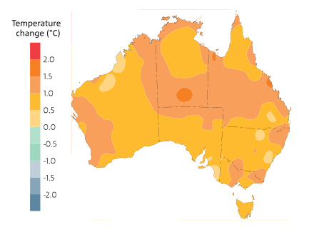
Maps of trends in time
Maps showing extent of change in a climate variable from a historic to a more recent point in time (see Figure 4, and also Figure 5 of Observed climate and sea-level change).
These maps are good at presenting trend information where the regional variability in change in a climate variable is of interest.
T1M1_Figure 4.png
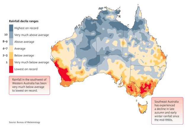
Decile maps
Decile maps showing amount of difference in a region or location from average levels Figure 5, and Figure 6 of Observed climate and sea-level change T1I2
A decile is one tenth of the values in a record. A decile map shows the extent that a climate variable is above average, average or below average for a specified period, in comparison with the entire record. For example, how wet is the most recent decade compared to the full record? Is it in the highest decile (very wet), the lowest decile (very dry) or somewhere in between? Deciles are useful as they allow comparison of one place with another when there is a lot of variation from place to place, as there is with rainfall in Australia.
T1M1_Figure-5.gif
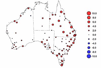
Combined approaches
Combined approaches, for example, maps showing trends at specific locations through symbol size, see Figure 6.
Combined approaches are useful where understanding regional variability is important and there is also incomplete information. The map must be evaluated as a whole, and not on the basis of a single record. Good questions to ask are:
- What proportion of stations is showing an increase/decrease?
- Are they clustered in a particular region?
T1M1_Figure 6.jpg
3. What trend information is available for Australia?
3.1 Trends in the oceans and coastal waters
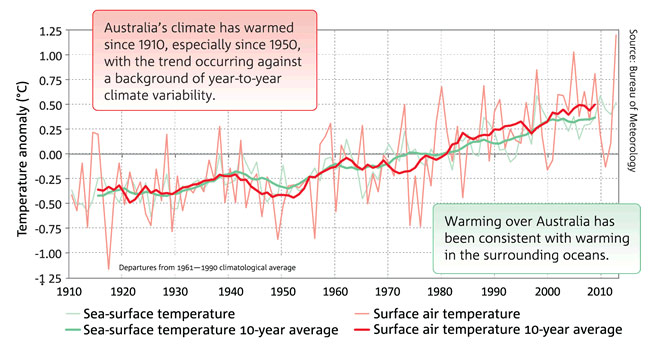
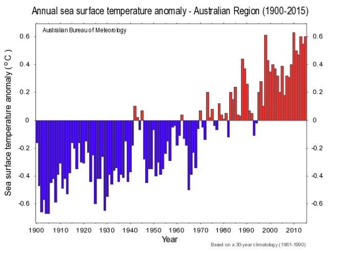
Clear and up-to-date information on recent trends is available for many climate variables, particularly those associated with temperature, from the Bureau of Meteorology website. For example, Figure 7 shows that sea surface temperatures around Australia have warmed since records began. The warming has been consistently identified in both air (see “Observed climate and sea-level change”) and oceanic measurements.
T1M1_Figure 7.png
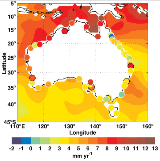
Sea levels reflect temperature trends, since an important cause of sea-level rise is thermal expansion. Sea levels around Australia show a similar increasing trend to that measured globally. There is some variability in the trend around the Australian coastline, with greater increases observed in the north, north-west and south-east than in the southern and mid-eastern regions. Figure 8 shows the recent trend of sea-level rise around Australia.
T1M1_Figure-8.gif
3.2 Trends over the land
There are clear trends in increasing temperatures throughout Australia and over time (see Figures 4 and 9). In contrast, Australian rainfall is highly variable, which makes it difficult to identify significant trends over time. Nevertheless some rainfall changes are discernible, notably declines in winter rainfall in the southwest and southeast of the continent in recent decades.
It is also difficult to draw conclusions regarding trends in the frequency and intensity of tropical cyclones in the Australian region because of the shortness of the satellite record, changes in historical methods of analysis, and the high variability in tropical cyclone numbers.
T1M1_Figure 9.png
4. How to use maps and graphs to understand local climate trends
Typical steps in using maps and graphics to understand local trends are to:
- Consider the area or location of interest, noting that because climate patterns can be quite large, broader-scale trend information can be informative and of value to local-scale considerations.
- Identify the climate variables of interest, and search the Bureau of Meteorology (http://www.bom.gov.au/climate/maps/) and Climate Change in Australia (http://www.climatechangeinaustralia.gov.au/en/climate-campus/australian-climate-change/australian-trends/) websites for relevant maps and graphics (both accessed 22 March 2016).
- Consider whether expert guidance is required to interpret available information and maps on some of the more variable climate records such as rainfall and windstorm.
- Consider whether your area of interest has any trends that are particularly relevant to local planning and decision-making, and incorporate the information in risk assessment if required.
Finally, while trend information on how the climate has changed over recent decades is important to inform decision-making, for costly decisions with a long-asset life it is important to also consider future climate change (See content on Causes of climate change and Climate change in Australia).
Source material
CSIRO and BoM (Bureau of Meteorology), 2014: State of the Climate 2014. Commonwealth of Australia, Canberra. Accessed 22 March 2016. [Available online at http://www.bom.gov.au/state-of-the-climate/].
CSIRO and BoM (Bureau of Meteorology), 2015: Climate Change in Australia. Information for Australia’s Natural Resource Management Regions: Technical Report, CSIRO and Bureau of Meteorology, Australia. Accessed 22 March 2016 [Available online at http://www.climatechangeinaustralia.gov.au/en/publications-library/technical-report/].